Ogilvy Serif
Ogilvy is one of the most recognized creative agencies—with 132 offices in 83 countries, the company is a truly global network. Looking at changes in the advertising industry and seeking to stay ahead, Ogilvy decided to streamline its organization and worked with the design firm Collins to create a new brand architecture and visual identity.
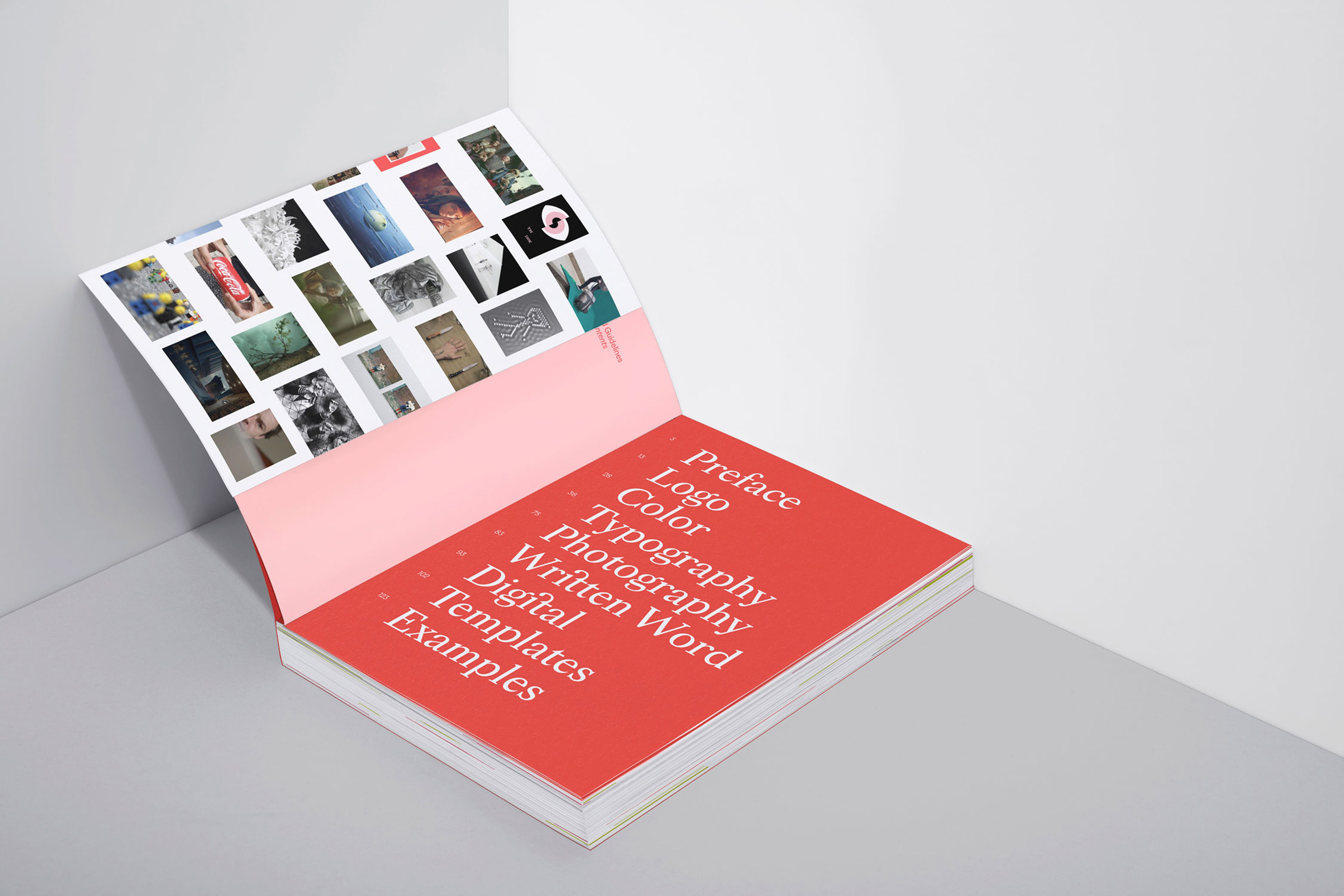
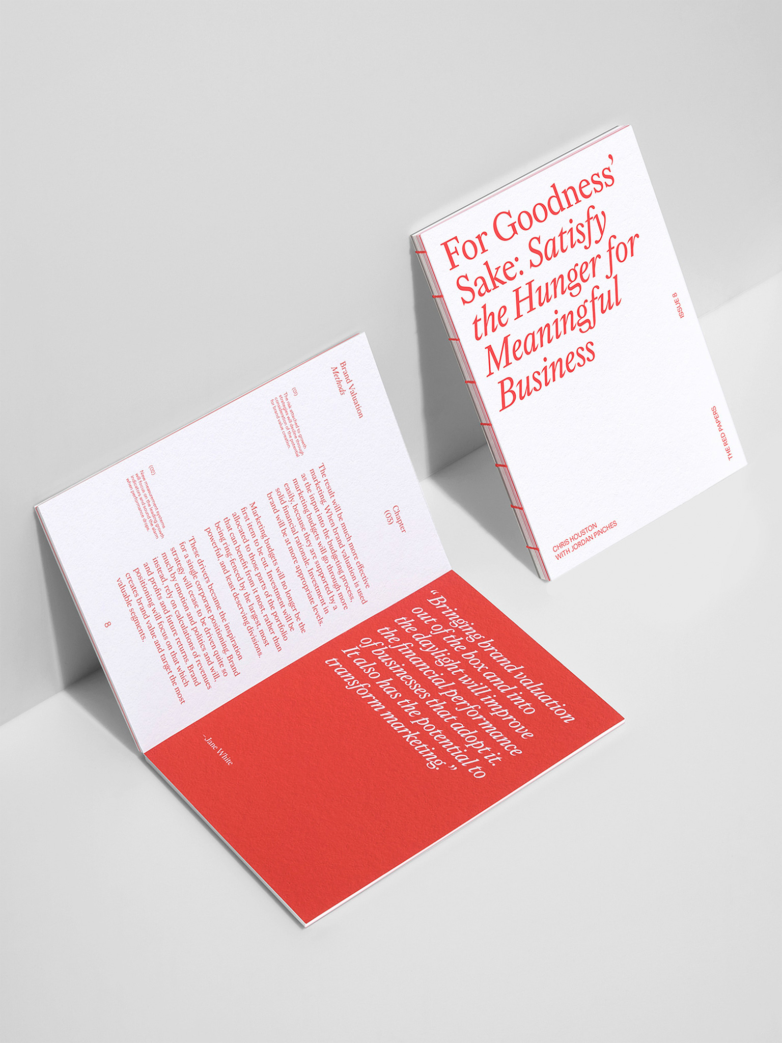
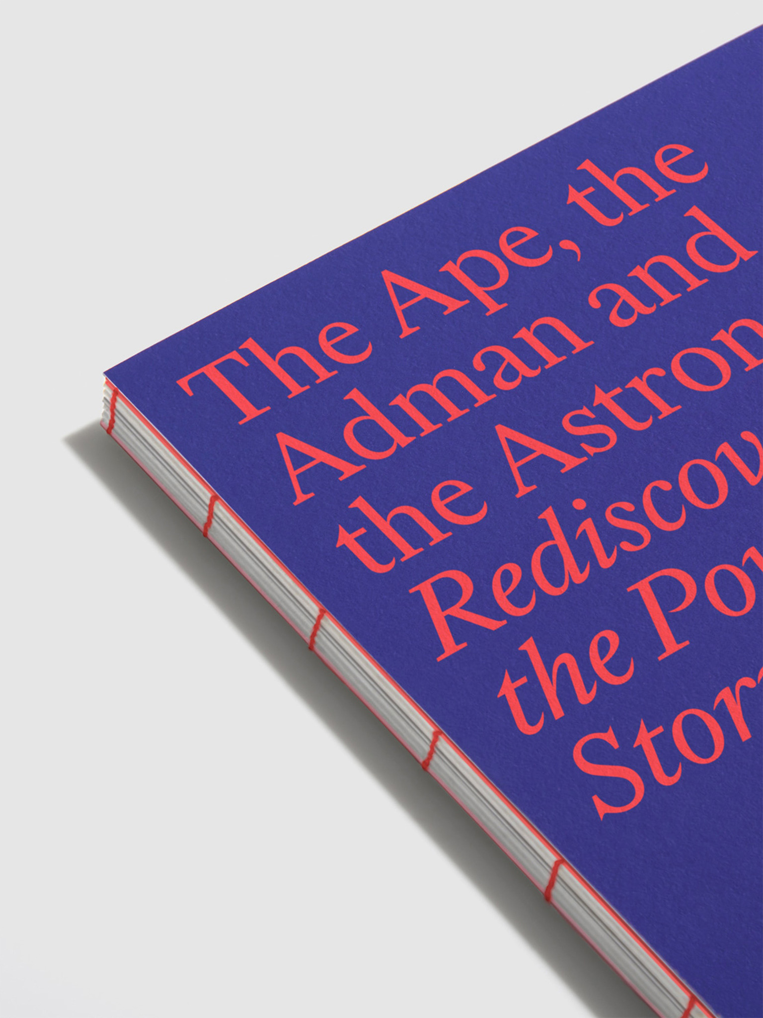
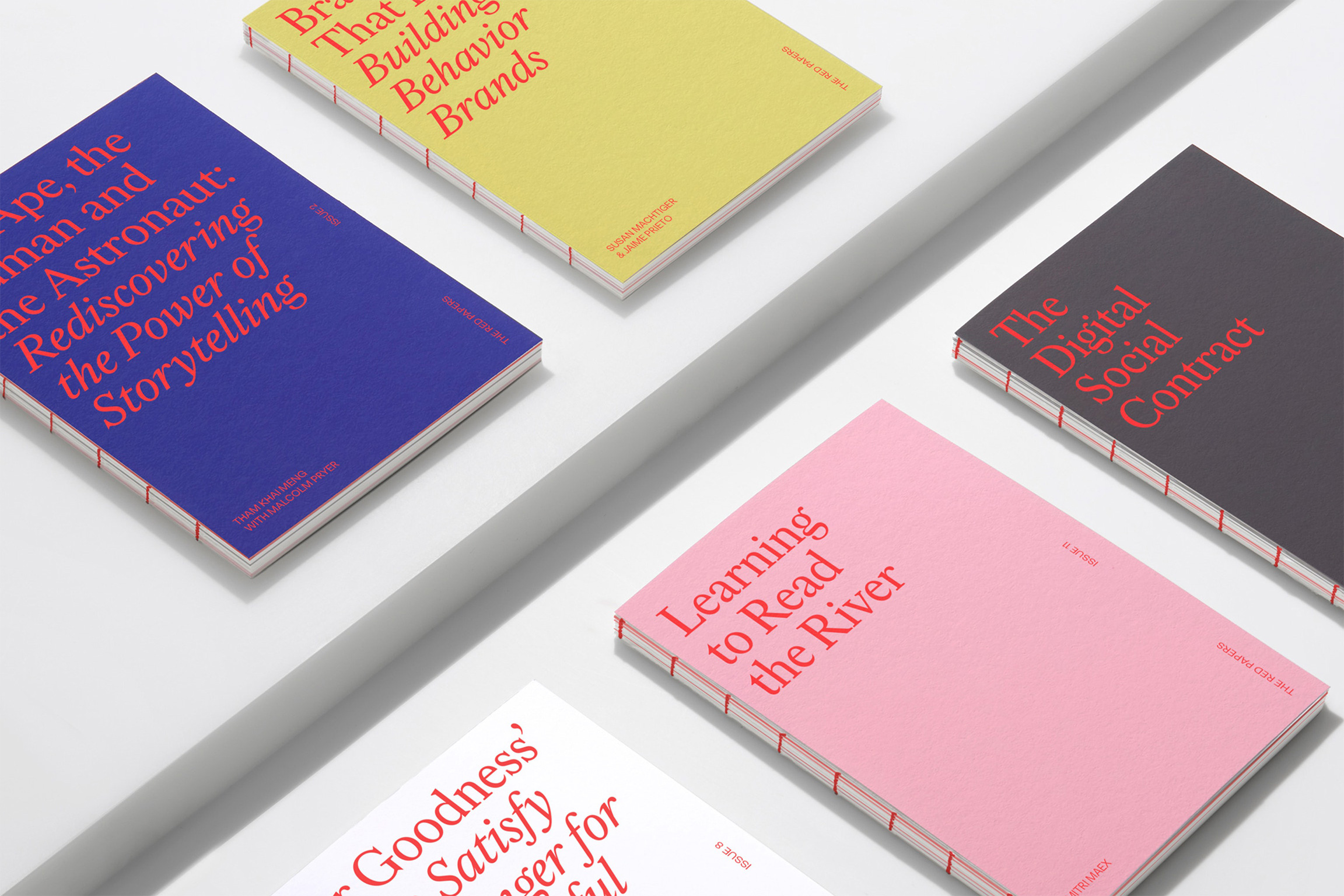
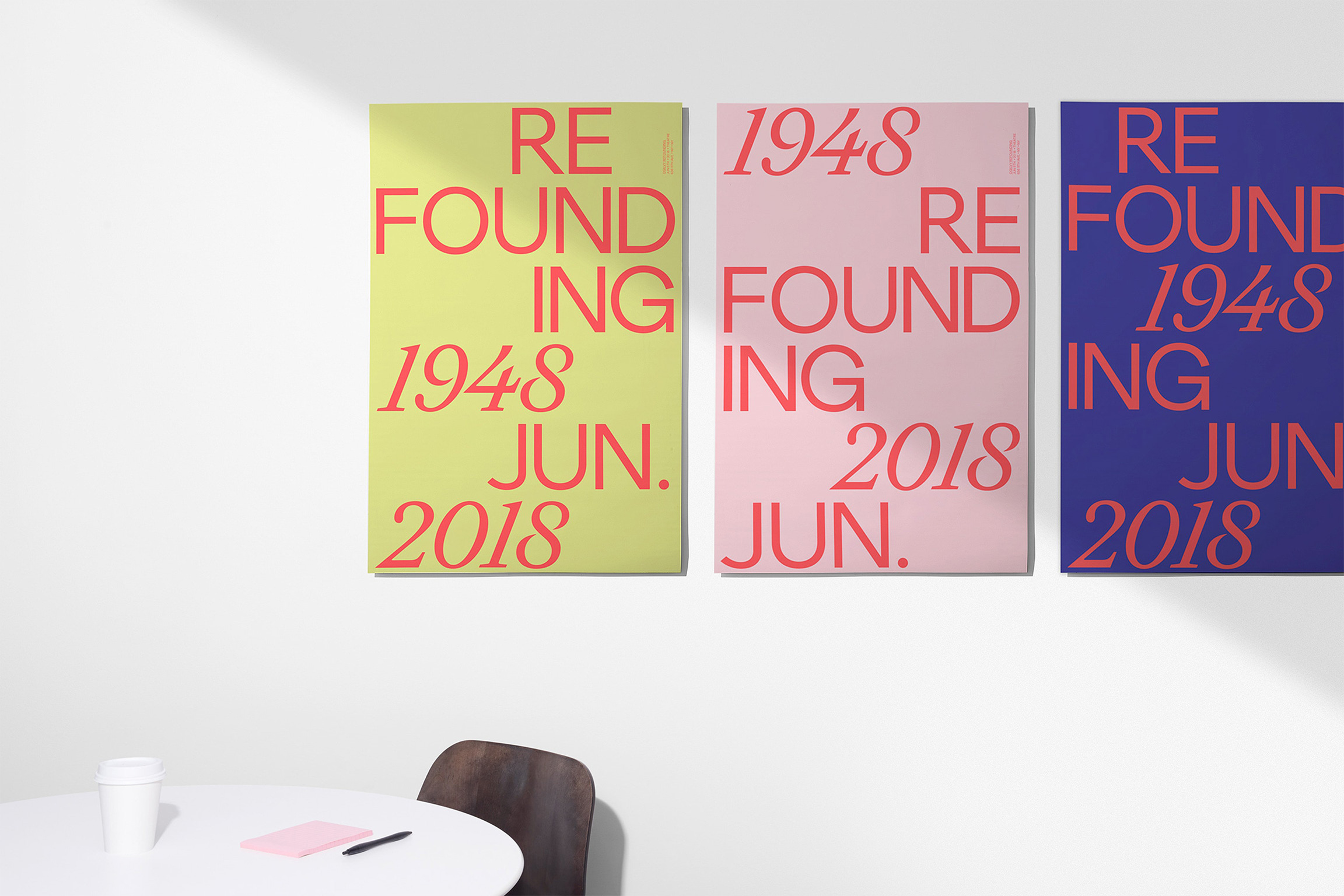
Collins drew from the agency’s British past and commissioned two new type families (a serif and a sans) from MCKL Type for Ogilvy. We worked with MCKL Type on Ogilvy Serif, a sharp interpretation of Baskerville with crisp details that sparkle at large sizes. Not quite a revival, Ogilvy Serif achieves a contemporary take on historical forms, bringing a consistent voice to the company across print and digital content. The type family consists of romans and italics in three weights, with extensive language support.


Elegant ligatures and ornamental alternates are included in Ogilvy Serif, allowing users of the typeface to exchange one form of a glyph for a more expressive one. Furthermore, the italics depart strongly from the romans, their steep slant and long entry and exit strokes offering yet another tool for adding dynamism and liveliness to compositions.
The new identity, grounded in the two type families and a unique color palette, replaced an identity in which the primary mark was David Ogilvy’s signature. This system is much more flexible and forward-looking, adaptable to challenges to come and yet connected to the company’s history and founder.
Collaborators
Direction: Thomas Wilder
Direction & Design: Jeremy Mickel